Chapter 14: Data presentation
In statistics, the four main stages of data handling are:
- collecting the data
- organising the data
- summarising the data
- presenting the data.
In this chapter, we will revise what you have learnt about data collection, organisation and summarising. Then we will explore more methods for presenting data.
14.1 Data collection
Data collection is gathering the facts and figures (the data) to use in statistical calculations. Some of the main ways of collecting data are listed below.
1. Asking questions: You can either ask questions in person (an interview), or using a written set of questions (a questionnaire), or you can ask everyone one in a specific group, such as a school or in a country (a census):
- An interview usually takes place between two people. One of the people is called the interviewer and the other is the interviewee or respondent. We use interviews when we can talk to the respondents directly.
- A questionnaire is a set of questions given to many people to complete.
- In a census, information is obtained from everyone in a particular group or population. An example of a census is asking everyone living in a village whether they feel that a new hospital should be built. Another example of a census is the national population census that is conducted in most countries around the world.
Here is an example of a questionnaire used to find out more about the students in JSS2.
Indicate your age by writing yes or no.
| Age | yes or no |
|---|---|
| Under 12 | |
| 1214 | |
| 1517 | |
| 1820 | |
| Other age |
2. Observing and recording what happens: Observations are the best method of collecting data when you need to look at behaviours or record events. You can observe and record what happens without asking questions.
3. Using existing data: We can use someone else's databases that they have already organised and presented online, or in books, newspapers or magazines.
Worked example 14.1: Choosing the best way to collect data
Halima's school is concerned about the safety of their students when they walk to school at the beginning of the school day, and home again at the end of the school day. They decide to find out how many cars pass the school at the beginning and the end of the school day.
Should the school collect data about the number of cars passing the school by doing a census?
Should the school use existing data to answer this question?
Should Halima collect data by observing and recording the number of cars?
-
Step 1: Decide whether the school will be able to find out how many cars pass the school doing a census.
In a census, data is collected about every car in a neighbourhood or a town or a country.
Answer: A census would not be the best way for the school to find out how many cars pass the school at the beginning and the end of the school day.
-
Step 2: Decide whether the school should use existing data to find out how many cars pass the school at the beginning and the end of the school day.
We use existing data when we want to analyse data that has already been collected and has been published either online or in a publication.
Answer: Using existing data is not a good way of finding out how many cars pass the school at the beginning and the end of the school day.
-
Step 3: Decide whether the school should have data collectors outside the school recording the number of cars passing to find out how many cars pass the school at the beginning and the end of the school day.
Observations are the best method of collecting data when you need to look at behaviours or record events.
Answer: The school should have data collectors outside the school recording the number of cars passing to find out how many cars pass the school at the beginning and the end of the school day
Exercise 14.1: Choose the best way to collect data
-
Chukwuma wants to find out how many people there are in the families of the JSS2 students at his school.
- Should Chukwuma go to the school library and look for a book where he can find out how many people there are in the families of the JSS2 students?
Using existing data such as a book in a library would not help Chukwuma as there is probably no book in the library containing this information.
Answer: Using existing data in the library would not be the best method.
- Should Chukwuma interview people one-on-one to find out the number of people in each student's family?
An interview is a formal or informal conversation between two or more people.
If Chukwuma interviewed all the girls and boys in JSS2 to ask this question, it would take him a long time.
Answer: Interviewing all the JSS2 students at his school would not be the best method.
- Should Chukwuma use a questionnaire find the answer to his question?
A questionnaire has a set of clear questions, usually with a choice of answers, and is the best method of collecting data to collect responses from a group of people, and you want to see general results.
A questionnaire would be the best way for Chukwuma to find out how many people there are in the families of the JSS2 students at his school.
-
Abayomi wants to find out what the average summer temperatures were for the last twenty years in the major cities in Nigeria.
- Should Abayomi interview people to find the answer to his question?
An interview is a formal or informal conversation between two or more people.
An interview will not help Abayomi find out what the average summer temperatures are over the last twenty years in the major cities in Nigeria.
Answer: Interviewing people would not be the best method of finding out the average summer temperature over the last twenty years in the major cities in Nigeria.
- Should Abayomi use observations to find the answer to his question?
Observations are the best method of collecting data when you need to look at behaviours, so observations will not help Abayomi find out the average summer temperatures over the last twenty years in the major cities in Nigeria.
Answer: Observing the weather would not be the best method of finding out the average summer temperature over twenty years in the major cities in Nigeria.
- Should Abayomi use existing data on the Nigerian Meteorological Agency website to find out the average summer temperature over the last twenty years of the major cities in Nigeria.
Using existing data means to use someone else's database that they have already organised and presented online. or in books, newspapers or magazines.
The Nigerian Meteorological Agency collects and analyses weather data and record their findings on their website.
Answer: The best way for Abayomi to find out the average summer temperature over twenty years in the major cities in Nigeria is by looking at the Nigerian Meteorological website.
14.2 Organising data
After data has been collected, the next step is organising the data, by bringing it together in a systematic way that makes it easier to read. We can organise data by using tallies and frequency tables.
How to count using tallies
As you learnt last year, tally marks are a useful way to collect data.
- Tallies are short vertical lines that are used to record items quickly as you count them.
-
When we add up all the tally marks, we know the frequency (how many times something happened).
-
When we are counting more than 4 objects, we make 4 vertical strokes. The fifth object or observation is represented by a diagonal line crossing the previous 4. So we write 8 as

It is easier for our eyes to see 1 group of 5 plus 3 individual strokes than it would be to count 8 vertical strokes.
- If we are given the tallies and have to find the number they represent, we count the groups of 5, then multiply the number of groups of 5 by 5, and then add the individual strokes.
\begin{array}{l}
{ (5 \times 1 ) + 3 = 8}
\end{array}
frequency The frequency is how many times an event occurred.
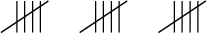
Here are some examples of correct tally markings.
| 3 |  |
| 4 |  |
| 5 |  |
| 8 |  |
| 10 |  |
| 12 |  |
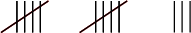
Worked example 14.2: Finding the tally total
Daniel counted the number of students playing tennis, and used tally marks to record the total.
What is the frequency?
-
Step 1: Count the number tally marks.

-
Step 2: Use multiplication to find the answer.
-
Step 3: The frequency is the number of times an event occurred. In this case, it is the number of students who are playing tennis. Write your answer in a sentence.
The frequency of students playing tennis is 5.
Exercise 14.2: Find a tally total
-
Ali counted the number of students on the bus and used tally marks to show the total.

What is the frequency?
Use multiplication to work out the answer.
The number of students on the bus (the frequency) is 28.
-
Ndidi counted the number of cars in the car park, and used tally marks to record this data.
What is the frequency?
The frequency is 15.
-
13 children are playing soccer today. Draw the tallies to represent 13.
Work out the number of groups of 5 in 13 and the number left over.
The tallies in your answer should look like this:
-
Fadekemi keeps a record of the number of families who live near him that recycle. He finds that the total number is 27. Draw tallies to represent 27.
Work out the number of groups of 5 in 27 and the number left over.
The tallies in your answer should look like this:

Organising data in frequency tables
Frequency is the number of times something happens, so a frequency table shows the number of times something happened.
To draw a frequency table, write the data in order, count up the various parts, and then show the data in a table.
You could organise the data in a vertical frequency table or a horizontal frequency table.
This is an example of a vertical frequency table.
| Score | Frequency |
|---|---|
| 1 | 3 |
| 2 | 2 |
| 3 | 5 |
| 4 | 0 |
| 5 | 2 |
| 6 | 5 |
Here is the same data given in a horizontal frequency table.
| Score | 1 | 2 | 3 | 4 | 5 | 6 |
| Frequency | 3 | 2 | 5 | 0 | 2 | 5 |
Worked example 14.3: Drawing up a frequency table
Fifteen students each had one chance to throw a die, and you recorded their scores.
This is your score sheet: 1; 5; 5; 1; 4; 5; 2; 4; 2; 3; 3; 4; 3; 2; 2
Write the data in ascending order.
Complete the following vertical frequency table:
Score Frequency 1 2 3 4 5 6 When you throw a die, there are 6 possible events (numbers the die can land on): 1, 2, 3, 4, 5 and 6.
-
Step 1: Write the data in ascending order, which is from smallest to largest.
To help you arrange your data in order, cross out a number once you have counted it.
The data arranged in ascending order is: 1; 1; 2; 2; 2; 2; 3; 3; 3; 4; 4; 4; 5; 5; 5
-
Step 2: Count how many times each number occurs and write the totals in the frequency table.
Score Frequency 1 2 2 4 3 3 4 3 5 3 6 0
Exercise 14.3: Draw up frequency tables
-
A maths teacher gave a test to 15 students.
Once she had marked them, she gave the students either an A (very good), a B, a C, a D, an E or an F (very poor).
The students' grades, in order, were: A, A, A, B, B, B, B, B, C, C, C, D, E, E, F.
Complete the following horizontal frequency table:
Grades A B C D E F Frequency Count the frequency of each grade and write it in the frequency table.
Grades A B C D E F Frequency 3 5 3 1 2 1 -
Fifteen students each had one chance to throw a die, and Nwanne recorded their scores.
Nwanne's score sheet looked like this: 2; 3; 1; 6; 5; 4; 4; 1; 1; 4; 2; 2; 3; 4; 1
- Write the scores in ascending order.
1; 1; 1; 1; 2; 2; 2; 3; 3; 4; 4; 4; 4; 5; 6
- Complete the following vertical frequency table:
Score Frequency 1 2 3 4 5 6 Score Frequency 1 4 2 3 3 2 4 4 5 1 6 1 -
Yomi recorded the scores from 15 students each having one chance to throw a die as follows:
2; 2; 5; 1; 5; 4; 6; 3; 5; 2; 2; 3; 4; 2; 5
- Write the scores in ascending order.
1; 2; 2; 2; 2; 2; 3; 3; 4; 4; 5; 5; 5; 5; 6
- Complete the following horizontal frequency table:
Score 1 2 3 4 5 6 Frequency Score 1 2 3 4 5 6 Frequency 1 5 2 2 4 1
14.3 Summarising data
Often we need to summarise the data after we have collected it and organised it. Summarising data allows us to see at a glance what important things the set of data has told us.
We use three main methods to sum up what the whole set of data has told us. These methods give us numbers that are called the mean, the mode and the median.
Calculating the mean of a data set
The mean is the most common measure of central tendency that is used. It can also be called the average.
The mean is calculated by adding all the values together and dividing by the number of values in the data set.
If there are numbers in a set, then the mean = =
For example, let us find the mean of this data set: 2; 6; 8; 10; 12; 14; 18
The mean =
mean The mean gives the average of a data set, and is calculated by adding the values in the data set and dividing the total by the number of values.
Worked example 14.4: Finding the mean of a set of numbers
Find the mean of the numbers 5; 8; 11; 10; 9; 10; 8; 7
-
Step 1: Add all the values together.
The sum of the values = 5 + 8 + 11 + 10 + 9 + 10 + 8 + 7 = 68
-
Step 2: Find the number of values in the set of numbers.
The number of values = 8
-
Step 3: Carry out the calculation to find the mean.
Mean =
Exercise 14.4: Find the mean of a set of numbers
-
Find the mean of the following set of numbers:
Add all the values together and divide by the number of values.
Mean =
The mean value of the set of data is 8.
-
Find the mean of the following data set correct to two decimal places:
Mean =
-
Find the mean of the following data set correct to two decimal places:
Mean =
Finding the mean of data in a frequency table
You can find the mean of the data in a frequency table by remembering that some of the data in the frequency table is repeated.
For example, If 4 appears six times, we use multiplication as a short method for adding the same number several times:
Worked example 14.5: Finding the mean of data in a frequency table
The frequency table below shows the test marks achieved by 20 students. The test was marked out of 10. Calculate the mean mark.
Mark out of 10 4 6 7 8 9 10 Frequency 2 4 3 6 3 2
-
Step 1: Add the marks of the 20 students.
Because some of the marks are repeated, we can use multiplication as a short method for adding the same number several times.
The sum of the marks of the 20 students
= (4 2) + (6 4) + (7 3) + (8 6) + (9 3) + (10 2)
= 8 + 24 + 21 + 48 + 27 + 20
= 148
-
Step 2: Find the mean.
Mean =
The mean mark of the 20 students is 7.4.
Exercise 14.5: Find the mean of data in a frequency table
-
The teacher gave the students an activity to do in class and timed how long (in minutes) the students took to complete it. He recorded the time taken by each student in the frequency table below.
Time taken in minutes 6 9 10 13 15 Frequency 4 4 5 4 3 Find the mean of the times. Give the answer correct to one decimal place.
Number of students = 4 + 4 + 5 + 4 + 3 = 20
We need to find the sum of the times taken by the 20 students. Because some of the times are repeated, we can use multiplication as a short method.
Sum of the times of the 20 students = (6 4) + (9 4) + (10 5) + (13 4) + (15 3) = 24 + 36 + 50 + 52 + 45 = 207
Mean = minutes
Remember to round off to one decimal place in your answer.
The mean time taken by the 20 students is 10.4 minutes.
-
The frequency table shows the ages of the students in a class.
Age of students in years 14 15 16 17 18 Frequency 2 3 10 15 10 Determine the mean age of the students. Give the answer correct to one decimal place.
Number of students = 2 + 3 + 10 + 15 + 10 = 40
Sum of ages of students = (14 2) + (15 3) + (16 10) + (17 15) + (18 10) = 28 + 45 + 160 + 255 + 180 = 668
Mean =
The mean age of the 40 students is 16.7 years.
The mode
The mode is the number (or data item) that appears the most times in a set of data. No calculation is needed to find the mode. You just find the value that appears most often or frequently.
For example, if you have the data set 2; 5; 7; 7; 10; 12; 15, the mode is 7, because 7 appears more often than any other number.
mode The mode is the data item/s that occur/s most often in a set of data.
If no number is repeated, then there is no mode for the set of data.
You must also be aware that there can be more than one mode, if there is more than one number that appears most often.
Worked example 14.6: Finding the mode where there is more than one mode
Consider this set of data:
6; 6; 7; 7; 8; 8; 9; 10; 11; 11
What is the mode of this set of data? If there are two or more modes, give all of the mode values.
-
Step 1: Sort the data so that it is in ascending order.
The data is already given in ascending order.
-
Step 2: Find the mode.
The mode is the value (or values) that appears the most.
The modes of this data set are 6; 7; 8 and 11, as each one appears twice.
Exercise 14.6: Find the mode
-
Find the mode of the data set 5; 6; 6; 7; 7; 8; 9; 10. If there are two or more modes, give all of them.
The data is already arranged in ascending order.
The modes of this data set are 6 and 7, as they each appear twice.
-
Find the mode of the data set 11; 9; 6; 5; 9; 7; 8; 11; 9.
In ascending order, the data set is:
5; 6; 7; 8; 9; 9; 9; 11; 11
The mode of the data set is 9.
-
Find the mode of this data set: 1; 2; 3; 4; 5; 1; 2; 3; 4; 1; 2; 3; 1; 2; 1.
In ascending order:
1; 1; 1; 1; 1; 2; 2; 2; 2; 3; 3; 3; 4; 4; 5
Mode: 1
-
Find the mode or modes of the following set of measurements: 4 m; 7 m; 6 m; 11 m; 8 m; 5 m; 9 m; 6 m; 11 m.
In ascending order:
4 m; 5 m; 6 m; 6 m; 7 m; 8 m; 9 m; 11 m; 11 m
Modes: 6 m; 11 m
-
Habib records the colours of schoolbags of everyone arriving at school in a frequency table.
Colour of schoolbag Frequency blue 19 red 14 white 18 black 56 green 28 What is the mode of this data set?
The mode is the data item that occurs most often, so it is the colour that occurs most often.
The mode of this data set is black, as that is the colour that appears most often.
When you are given a set of values or numbers, the mode is the item that occurs most often.
But you work out the mode in a different way when you have a data set that is made up of categories, such as colours, and the frequency of those categories. Then the mode is the category that occurs most often, so it is the category with the largest frequency.
The median
When a set of data values is arranged in ascending order, the value that is in the middle of the data set is called the median.
For example, in the data set 2; 3; 4; 5; 6; 7; 8, the middle number is 5, so the median is 5.
median The median is the middle value in a data set arranged in ascending order.
We need to consider two cases when we find the median of data:
- when there is an odd number of data values
- when there is an even number of data values.
Worked example 14.7: Finding the median of an odd number of values
Find the median of the data set 4; 6; 7; 4; 3; 4; 8; 2; 9; 7; 2.
-
Step 1: Arrange the numbers in ascending order.
2; 2; 3; 4; 4; 4; 6; 7; 7; 8; 9
-
Step 2: Find the middle value.
There are 11 items of data. This is an odd number of items, so the median is the 6th value.
There are five numbers to the left of the third 4, and 5 numbers to the right of the third 4.
The median of the data set is 4.
Worked example 14.8: Finding the median of an even number of values
Find the median of the set of numbers: 4; 6; 4; 7; 2; 3; 8; 9; 7; 4.
-
Step 1: Arrange the numbers in ascending order.
2; 3; 4; 4; 4; 6; 7; 7; 8; 9
-
Step 2: Find the middle value in the set of data.
There are 10 items of data. This is an even number of data items, so the median will lie between the 5th and 6th values.
This means that the median will lie between the third 4 and the 6, so we find the number that is between 4 and 6. This is the same as the average of 4 and 6, which we get by adding 4 and 6 and dividing that by 2.
The median
The median of the set of numbers is 5.
Exercise 14.7: Find the median of a set of data
-
Find the median of the following set of values:
5; 6; 7; 10; 11; 6; 10; 11; 8
Arrange the values in ascending order:
5; 6; 6; 7; 8; 10; 10; 11; 11
Find the middle value.
There are 9 values. This is an odd number of items, so the median is the 5th value.
Median: 8
-
Find the median of the following set of values:
11; 5; 9; 9; 7; 5; 5; 6
In ascending order:
5; 5; 5; 6; 7; 9; 9; 11
There are 8 items of data. This is an even number of data items, so the median will lie between the 4th and 5th values.
This means that the median will lie between the 6 and the 7, so find the average of 6 and 7.
Median
Median: 6.5
-
Find the median of the following set of values:
7; 6; 9; 25; 6; 7; 11; 10; 15; 8; 6
In ascending order:
6; 6; 6; 7; 7; 8; 9; 10; 11; 15; 25
There are 11 items of data, which is an odd number, so the median is the 6th value.
Median: 8
Finding all three summary measures
Most often, you will be asked to find mean, the mode and the median for the same data set. Each of these three measures is a different way of working out a value that is close to the centre of a data set, so it "summarises" the data set. These measures are called measures of central tendency.
measures of central tendency The measures of central tendency summarise a data set by giving a value that is close to the centre of a data set. The measures used most often are the mean, mode and median.
Worked example 14.9: Finding the measures of central tendency
You are given the following data set:
8; 7; 9; 6; 10; 11; 7; 7; 8
- What is the mean of the data set? Round your answer to two decimal places.
- What is the mode of the data set?
- What is the median of the data set?
- List the measures of central tendency of the data set.
-
Step 1: Find the mean of the data set and round the answer to two decimal places.
To find the mean, add up the numbers in the set and divide by how many numbers are in the set.
The sum of all the values is 8 + 7 + 9 + 6 + 10 + 11 + 7 + 7 + 8 = 73, and there are 9 values.
\begin{array}{ll} \text{Mean} & {= \frac{73}{9}} \\ & {= \text{8.11}} \\ \end{array} -
Step 2: Find the mode of the data set.
Start by arranging the data in ascending order:
6; 7; 7; 7; 8; 8; 9; 10; 11
In this data set, there is a single mode: 7, which appears three times.
Mode = 3
-
Step 3: Find the median of the data set.
There are 9 items of data. This is an odd number of items, so the median is the 5th value.
Median = 8
-
Step 4: List the measures of central tendency.
- Mean: 8.11
- Mode: 7
- Median: 8
Exercise 14.8: Find the measures of central tendency
-
Consider the following data set: .
- What is the mean of the data set? Round your answer to two decimal places.
To find the mean add the values and divide by the number of values.
Sum of the values = 11 + 8 + 7 + 9 + 8 + 5 + 7 + 9 + 6 = 70
Number of values = 9
\begin{array}{ll} \text{Mean} & {= \frac{70}{9}} \\ & {= \text{7.78}} \\ \end{array}- What is the mode of the data set?
In ascending order:
In this set of values 7, 8 and 9 each occur twice.
Modes = 7; 8 and 9
- What is the median value of the data set?
There are 9 values, so the median is the 5th value.
Median = 8
- List the measures of central tendency.
Mean: 7.78
Modes: 7; 8 and 9
Median: 8
-
Find the mean, mode and median of the data set (round to two decimal places where necessary):
Mean:
Sum of all the values =
Number of values = 6
\begin{array}{ll} \text{Mean} & {= \frac{46}{6}} \\ & {= \text{7.67}} \\ \end{array}Mode:
In ascending order:
Mode = 7
Median:
There are 6 values, so the median will lie between the 3rd and 4th values, which are 7 and 7.
Median
The measures of central tendency are:
-
Mean: 7.67
-
Mode: 7
-
Median: 7
-
14.4 Data presentation
Once data has been collected, organised and summarised, it needs to be represented graphically, so that it can be interpreted and shared with other people. This is called data presentation.
Graphs are useful as they give a picture of the results that is easy to understand. We will use bar charts and pie charts to present our data.
data presentation Data presentation is representing data results graphically so they can be interpreted and shared with other people.
Bar charts
Bar charts are used to display data that has been collected and organised in categories. An example of categories is the different colours of schoolbags that we looked at earlier in this chapter.
Bar charts make it easy to compare the different categories with each other. A bar chart uses either horizontal or vertical bars to show the comparison between the categories:
- One axis shows the categories being compared.
- The other axis shows the frequency.
- The length of each bar shows the frequency of that category.
bar chart A bar chart is a type of graph that uses either horizontal or vertical bars to show how categories compare with each other.
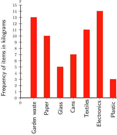
Worked example 14.10: Reading information from a bar chart
School A started a recycling project. The bar chart below shows how many kilograms of each item was collected for recycling last week.
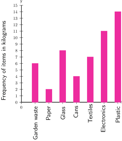
- Of which item did the school collect the greatest number of kilograms?
- Of which item did the school collect 7 kg?
- Of which item did the school collect the smallest number of kilograms?
-
Step 1: Find the highest bar on the graph, and use a ruler to find the frequency for that item.
From the graph we can see that the highest bar shows 14 kg, and it is for plastic.
More kilograms of plastic were collected than any other category.
-
Step 2: Find 7 kg on the vertical axis and then draw a horizontal line across until you reach the bar that is 7 kg high.
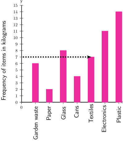
From the graph we can see that that bar that is 7 kg high is textiles.
The school collected 7 kg of textiles.
-
Step 3: Find the shortest bar.
From the graph we can see that the shortest bar shows 2 kg, and it is for paper.
The smallest number of kilograms collected was for paper.
Exercise 14.9: Read information from bar charts
-
School B also started a recycling project. The bar chart below shows how many kilograms of each item they recycled in one week.
- Of which item did the school collect the most, in kilograms?
The tallest bar on the graph is 14 kg, for electronics.
In kilograms, the item collected the most was electronics.
- From the recycled items, of which item did the school collect 13 kg?
Find 13 kg on the vertical axis and then draw a horizontal line across until you reach the bar that is 13 kg high.
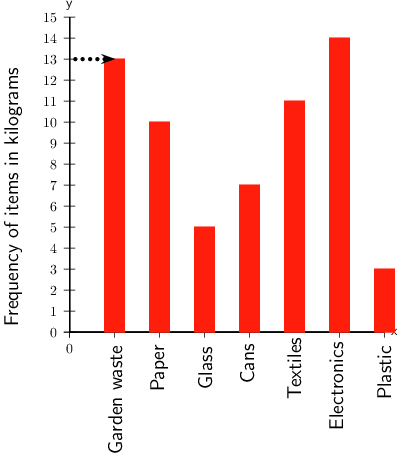
From the graph, you can see that that bar that is 13 kg high is for garden waste.
The school collected 13 kg of garden waste.
- Of which item did the school collect the least, kilograms?
Find the shortest bar.
From the graph we can see that the shortest bar shows 3 kg, which was for plastic.
In kilograms, the item collected the least was plastic.
-
School C also started a recycling project. The bar chart below shows how much of each item they recycled in one week.
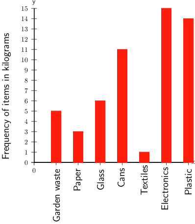
- Of which item did the school collect the most?
The highest bar on the graph is the 15 kg bar for electronics.
The item collected the most was electronics.
- Of which item did the school collect 1 kg?
Find 1 kg on the vertical axis and then draw a horizontal line across until you reach the bar that is 1 kg high.
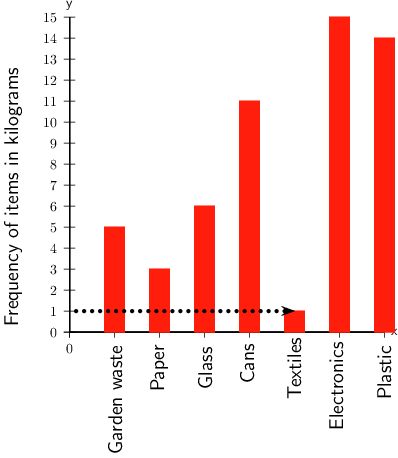
The school collected 1 kg of textiles.
- Of which item did the school collect the least?
Find the shortest bar, which is the 1 kg bar for textiles.
The school collected the least of textiles.
Pie charts
A pie chart is a circle that is divided into sections, so that it looks like a pie cut into slices.
The whole pie chart stands for the total amount of data.
Each slice or sector stands for a named part or category of the data.
- The size of each sector shows the size of that category of the data.
- The size of a sector is often given as a percentage.
A pie chart also makes it easy to compare the categories of a set of data.
pie chart A pie chart is a circle that is divided into sectors, with each sector showing the size of one category of the data.
Worked example 14.11: Reading information from pie charts
The following pie chart shows the amount of drinking water from one water purification plant that was used in four different districts in Nigeria in January 2018.
- Which district used the most water?
- Which district used the least water?
- What is the difference in the percentage of the district that used the most drinking water and the district that used the least?
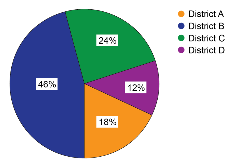
The key for the pie chart is the list of districts at the right-hand side. The colour for each district in the key corresponds with the colour used for the pie chart sector for that district.
-
Step 1: To find the most water used, you need to find the highest percentage on the pie chart. You will see that this is also the biggest slice. Then check in the key which name corresponds with the colour of that sector.
The largest slice and percentage is 46%. This sector is blue, so it is for District B.
District B used the most water.
-
Step 2: Find the smallest percentage on the pie chart.
The smallest slice and percentage is 12%. This sector is purple, so it is for District D.
District D used the least water.
-
Step 3: For question 3 you need to do a calculation to get the answer. You have found the percentages for the most and least water used in Steps 1 and 2. Now calculate the difference between the percentages.
Difference in percentage between most and least water used = %
Exercise 14.10: Read information from pie charts
-
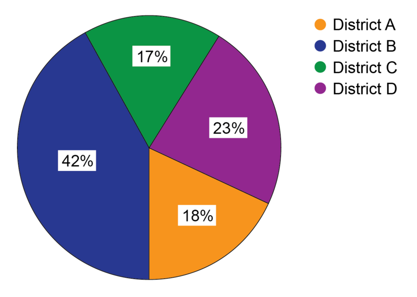
In Nigeria in March 2019, the education department calculated the total number of Junior Secondary students in four districts. The pie chart provided shows a comparison in percentages of the numbers of JS students in the four districts.

- Which district has the most students?
Find the highest percentage on the pie chart.
District B has the most students because it has the largest percentage of 44%.
- Which district has the fewest students?
Find the smallest percentage on the pie chart.
District C has the fewest students because it has the smallest percentage of 15%.
- What is the difference in the percentage between the district with the most students and the district with the fewest students?
Calculate the difference in percentages:
Difference in percentage %
The difference in the percentage between the districts with the most students and the fewest students is 29%.
-
After the last district elections, statistics were published on what percentage of the adult population who qualified to vote actually voted in the election. This is called the voter turnout. The pie chart below shows these percentages for four districts.
- In which district was the voter turnout the best?
Find the highest percentage on the pie chart.
The voter turnout was the best in District B, because 42% of adults voted, which is the highest percentage.
- In which districts was the voter turnout the worst?
Find the smallest percentages on the pie chart.
The smallest percentage is 17%, but 18% is very close to 17%.
The districts that had the worst voter turnout were District C with 17% and District A with 18%.
- Where should the authorities carry out voter education, based on the information provided on this pie chart?
Students will provide their own answers. One possible answer is provided here.
The districts with the worst voter turnout need the most voter education. But the voter turnout is below 50% in all the districts, so they all need voter education. This would encourage more people to vote.
Calculating missing values in a pie chart
You may be asked to find the missing value for one of the sectors of a pie chart. To do this, remember that where the sectors are marked in percentages, the percentages must add up to 100%.
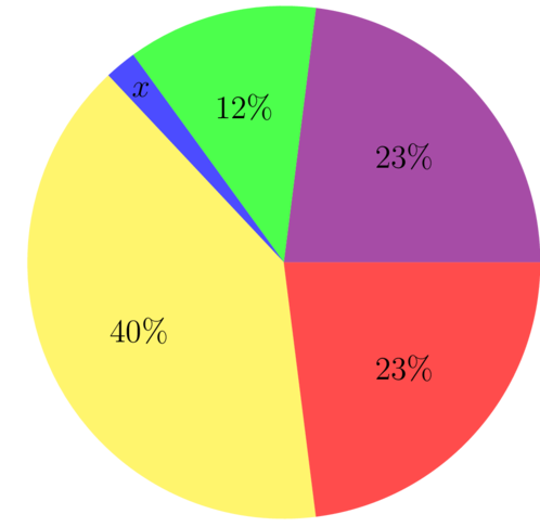
Worked example 14.12: Calculating the missing value of a sector of a pie chart
The following pie chart has one sector marked .
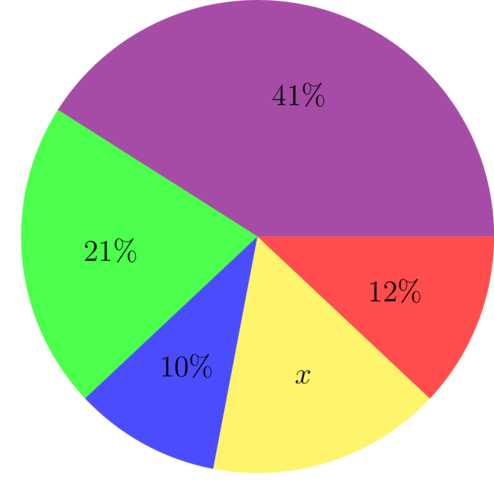
- Calculate the missing value represented by .
- Which sector is the largest?
- Which sector is the smallest?
- Which sector of the pie chart represents the mode of this data set?
-
Step 1: Use the fact that the percentages of the sectors must add up to 100% to find the value of .
\[ \begin{align} 41+21+10+x+12&=100 \\ 84+x&=100 \\ x&=100-84 \\ \therefore x&=16% \end{align} \] -
Step 2: If you are asked to, write the missing value on the pie chart.

-
Step 3: To answer question 2, find the largest sector.
From the pie chart, we can see that the largest sector is the one marked 41%.
-
Step 4: To answer question 3, find the smallest sector.
From the pie chart, we can see the smallest sector is the one marked 10%.
-
Step 5: To answer question 4, find the mode.
The sector with 41% is the mode of this data set.
Notice that the pie chart shows the frequencies of various categories. In this case, the frequencies are given as percentages. The mode is the item or category that occurs most often. So, here, the mode is the category that has the highest frequency, and that is the largest sector.
Exercise 14.11: Calculate missing value of a sector
-
You are given the following pie chart:
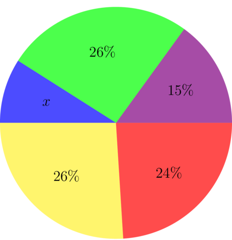
- Calculate the missing value represented by .
\[ \begin{align} x + 26 + 15 + 24 + 26 &= 100 \\ x &= 100 - 91 \\ \therefore x&=9 \\ \end{align}\]
- Which sector is the smallest?
The smallest sector is the one marked , which is 9%.
- Which sector is the largest?
There are two sectors marked 26%, so the two largest sectors are marked 26%.
-
The following pie chart has one sector marked %
- Calculate the missing value represented by .
\[ \begin{align} x + 12 + 23 + 23 + 40 &= 100 \\ x &= 100 - 98 \\ \therefore x&=2\\ \end{align}\]
- Which sector is the smallest?
The smallest sector is the sector marked , which is 2%.
- Which sector is the mode?
The mode is the sector with the highest frequency, so the mode is the sector with 40%.
14.5 Ranking and presenting data in tables
Data presented in ordered lists, tables, charts or schedules is easier to read and analyse than a list of unorganised values.
Putting data in rank order
One way of organising a list of data is by writing the data in rank order. This means to arrange the data in descending order, or from highest to lowest. Rank order is the opposite of ascending order.
- The marks A, B, C, D, E and F are written in rank order.
- The marks F, E, D, C, B and A are not written in rank order.
rank order Rank order means arranged from highest to lowest.
Worked example 14.13: Working with data in rank order
Eighteen students wrote a maths revision test. Their marks were: B, D, C, A, C, E, D, D, F, D, B, E, D, D, A, D, B and D.
- What is the mark of the student who came 6th?
- Three students got a B. What is their position?
-
Step 1: To find the mark of the student who came 5th, first arrange the marks in rank order. A is the highest mark, so start with A.
To make sure that you don't leave any marks out, draw a line through each mark in the given list as you use it.
The marks in rank order are:
A, A, B, B, B, C, C, D, D, D, D, D, D, D, D, E, E, F
-
Step 2: To find the mark of the student who came 6th, count the ranked marks from left to right, until you end up at the 6th mark.
The 6th student's mark was a C.
-
Step 3: Find the position of the three students who got a B.
The three students who got a B are in the third position.
All the students who got the same mark have the same rank as the first student who got that mark.
The two students who got an A are in the first position.
The three students who got a B are in the third position.
The one student who got a C is in the sixth position.
The eight students who got a D are in the seventh position.
The two students who got an E are in the sixteenth position.
The student who got an F is in the eighteenth or last position.
Exercise 14.12: Work with data in rank order
-
A class wrote a Biology exam. Their marks were: B, E, A, D, D, C, E, F, D, B, C, A, E, F, C, A, D, C, A, E, B.
- Write the marks in rank order.
A, A, A, A, B, B, B, C, C, C, C, D, D, D, D, E, E, E, E, F, F
- How many students wrote the exam?
21 students wrote the exam.
- What was the highest mark?
The highest mark was an A.
- What was the lowest mark?
The lowest mark was an F.
- What is the position in the class of the students who got a C?
Count from left to right until you get to the first C.
The students who got a C all came 8th in the class.
- Find the number of students that failed the exam if a mark of D and above is a pass.
The number of students that failed is the number that got an E number that got an F: 4 + 2 = 6 students
The number of students that failed was 6.
- What fraction of the students got either an A or a B?
Number of students that got an A or a B = 4 + 3 = 7
Number of students that wrote the exam = 21
Fraction of students that got either an A or a B = =
The fraction of students that got either an A or a B is .
-
The History students wrote a test out of 100.
Their marks, in rank order, were: 85, 80, 76, 74, 73, 68, 64, 62, 57, 57, 57, 49, 47, 46, 39.
- How many students wrote the test?
Fifteen students wrote the test.
- What was the highest mark?
The highest mark was 85.
- What was the lowest mark?
The lowest mark was 39.
- What was the mark of the student who came third?
The mark of the student who came third was 76.
- What is the position of the student who got 62 out of 100?
The student who got 62 is in the eighth position.
- Three students got 57 marks. What is their position?
The three students are in the ninth position.
Organising data in tables
Putting data into a table is a good way to organise the data. We often see data organised in tables in newspapers, on television and in learning materials.
The columns of a table (and sometimes the rows) have clear headings that describe exactly what type of information is given in each column.
The table itself may also have a heading that tells us what it is about.
Worked example 14.14: Working with tables
The table below records the names of players who scored goals during matches that their football team played over one football season.
Number of goals scored by members of the football team
| Match number | Goals scored | Goal scorers |
|---|---|---|
| Match 1 | 3 | Adamu, Chibuzo, Adamu |
| Match 2 | 1 | Adamu |
| Match 3 | 2 | Abidemi, Abidemi |
| Match 4 | 4 | Usman, Babatunde, Babatunde, Usman |
| Match 5 | 3 | Adamu, Abidemi, Usman |
| Match 6 | 0 | |
| Match 7 | 2 | Adamu, Adamu |
| Match 8 | 4 | Babatunde, Abidemi, Adamu, Abidemi |
| Match 9 | 1 | Babatunde |
- How many goals were scored altogether?
-
Use the information from the given table to complete the frequency table below:
Goal scorer Frequency Adamu Chibuzo Abidemi Babatunde Usman - Rank the goal scorers.
- Who scored the most goals?
- Who scored the second most goals?
-
Step 1: Find out how many goals were scored by adding up the goals scored in the table.
goals
Twenty goals were scored.
-
Step 2: Complete the frequency table by taking Adamu first and counting the number of goals he scored, then how many goals Chibuzo scored, and so on.
Draw a line through the name each time you count the player so you don't leave any out.
Goal scorer Frequency Adamu 7 Chibuzo 1 Abidemi 5 Babatunde 4 Usman 3 Check by adding the values in the frequency column to make sure that you have recorded all the goals:
7 + 1 + 5 + 4 + 3 = 20 goals
-
Step 3: To rank the scorers means to arrange the names from the player who scored the most goals to the player who scored the least goals. Rank the goal scorers.
The goal scorers ranked are: Adamu, Abidemi, Babatunde, Usman, Chibuzo.
-
Step 4: Find the person who scored the most goals.
Adamu scored the most goals (7 goals), and he is ranked first.
-
Step 5: Find the person who scored the second most goals.
Abidemi is ranked second, and he scored the second most goals (3 goals).
Exercise 14.13: Work with tables
-
The table below shows the average maximum and minimum temperatures in Jos, measured in degrees centigrade () during each month of the year.
Month of the year Average min Average max Jan 14 28 Feb 15 30 Mar 18 32 Apr 19 31 May 18 29 Jun 18 27 Jul 17 25 Aug 17 24 Sep 17 27 Oct 17 29 Nov 16 29 Dec 14 28 - During June, what is the average minimum temperature and the average maximum temperature in Jos?
In June, the average minimum temperature in Jos is , and the average maximum temperature is .
- During which months of the year does Jos have its lowest minimum temperature?
The lowest minimum temperature given in the table is , which happened in January and December.
Jos has its lowest minimum temperature in January and December.
- During which month of the year does Jos have its highest maximum temperature?
The highest maximum temperature given in the table is , which happened in March.
Jos has its highest maximum temperature in March.
- During which months does Jos have an average maximum temperature of ?
Jos has an average maximum temperature of in May, October and November.
- What is the difference in temperature between the average maximum and average minimum temperatures in December?
In December the average minimum temperature is , and the average maximum temperature is .
The difference is .
-
Railway timetables give the times that trains arrive at a station and leave from the station.
The following timetable shows the times of the train service between Lagos and Kano. There is only one train per week from Lagos to Kano, and one train per week from Kano to Lagos.

From Lagos to Kano From Kano to Lagos Station Arrives Departs Station Arrives Departs Lagos 12:00 (Fri) Lagos 15:10 (Tues) Ibadan 16:42 17:02 Ibadan 10:08 10:28 Oshogbo 19:24 19:29 Oshogbo 07:41 07:46 Akerri 04:55 04:58 Akerri 22:12 22:15 Zaria 14:38 14:48 Zaria 12:22 12:32 Kano 18:30 (Sat) Kano 09:00 (Mon) - On which day of the week does the train leave Lagos?
The train leaves Lagos on a Friday.
- What time does the train from Lagos to Kano leave Lagos?
The train leaves Lagos at 12:00.
- How long does the train from Lagos to Kano stay in Oshogbo?
The train arrives in Oshogbo at 19:24 and leaves at 19:29.
Time the train stays in Oshogbo 19:29 19:24 5 minutes
The train stays in Oshogbo for 5 minutes.
- How long does the train from Lagos to Kano take to travel between Oshogbo and Akerri?
The train leaves Oshogbo at 19:29 on a Friday evening and arrives in Akerri at 04:55, early on Sunday morning.
From 19:29 to midnight (00:00 or 24:00) 4 hours 31 minutes.
From 00:00 to 04:55 4 hours 55 minutes.
Time taken to travel between Oshogbo and Akerri:
4 hours 31 minutes 4 hours 55 minutes
4 hours 4 hours 31 minutes 55 minutes
8 hours 86 minutes
8 hours 1 hour 26 minutes
9 hours 26 minutes
The train takes 9 hours 26 minutes to travel from Oshogbo to Akerri.
- On which day of the week does the train leave Kano?
The train leaves Kano on a Monday.
- What time does the train from Kano to Lagos depart from Kano?
The train leaves Kano at 09:00.
- How long does the train from Kano to Lagos take to travel between Zaria and Ibadan?
The train leaves Zaria at 12:32 on a Monday afternoon and arrives at Ibadan at 10:08 on Tuesday morning.
From 12:32 to midnight (00:00 or 24:00) 11 hour 28 minutes.
From 00:00 to 10:08 10 hours 8 minutes.
Time taken to travel between Zaria and Ibadan: 11 hours 28 minutes 10 hours 8 minutes 21 hours 36 minutes
The train takes 21 hours 36 minutes to travel from Zaria to Ibadan.
14.6 Summary
- Collecting, organising, summarising and presenting data form the data handling cycle.
- Some of the main ways of collecting data are:
- asking questions using an interview, a questionnaire, or a census
- observing and recording what happens
- using existing databases from books, newspapers, magazines, or online.
- We can organise data using tallies and frequency tables.
- Tallies are an easy way to keep count, by drawing a stroke for each item counted, and drawing a diagonal line through each group of four strokes so that we are counting in fives.
- The frequency is the number of times an even occurs, and a frequency table gives a list of the categories, together with the frequency for each category.
- We need to summarise the data after we have collected and organised it by finding the measures of central tendency.
- A measure of central tendency is usually a single value that represents the whole set of data. The mean, mode and median are measures of central tendency.
- The mean gives the average of a data set, and is calculated by adding the values in the data set and dividing the total by the number of values.
- The mode is the data item/s that occur/s most often in a set of data.
- The median is the middle value in a set of data values.
- Data presentation is representing data results graphically so they can be interpreted and shared with other people.
- Two methods of presenting data graphically are bar charts and pie charts. Information can be read from both types of charts.
- A bar chart is a type of graph that uses either horizontal or vertical bars to show how categories compare with each other.
- A pie chart is a circle that is divided into sectors, with each sector showing the size of one category of the data.
- Tables are also a good way to organise and present data. The columns (and sometimes the rows) have clear headings that describe exactly what type of information is given.
- Rank order means to arrange the data in descending order, or from highest to lowest.